Simplicity is the ultimate form of sophistication. – Leonardo da Vinci
A logo is the image embodying an organization. It is meant to represent a company’s brand or corporate identity and have immediate customer recognition. Simple graphics or wordmarks are generally used for a logo. A wordmark is a logo that uses text only (think Subway, Coca-Cola and FedEx). Simplicity is key for a good logo.

Simple
Simple logos = Memorable. A memorable logo will aid in brand recognition. Simple is always better when it comes to logos.
Memorable
A memorable logo is unique and recognizable. People should be able to immediately associate your logo with your company and no one else.
Avoid Trends
Leave trends to the fashion industry. Brand identity is concerned with longevity. Trends come and go and following them in logo design should avoided.
Versatile
Effective logos are able to be used in a variety of mediums and applications. Logos should be functional. A well designed logo will look good printed on the side of a pencil or a building.
Appropriate
A logo that is appropriate would be appreciated by the target audience. The more a logo reflects its’ company the more appropriate and effective it is.
Essential logo design rules:
- Avoid any gradients
- No more than 3 spot colors (always use PMS colors)
- Avoid all cap typefaces or English script
- Use the K.I.S.S Principle (Keep It Super Simple)
- Must be legible when scaled down
- Avoid visual clichés
- Must be simple, clean and clear
Effective logos are able to be:
- Printed in one color
- Printed on the something the size of a penny
- Printed on something as large as a billboard
- Printed in reverse colors (light on dark & dark on light)
- Embroidered & Screen printed onto clothing
- Used both in horizontal and vertical format
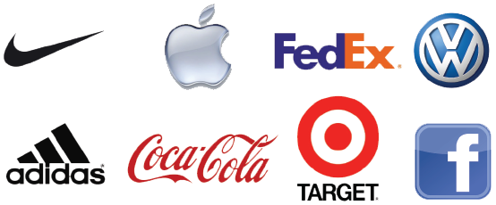
Good Logo Designs
It’s an Identity
When we design logos we think about more than what looks nice. Our goal is to create a logo that represents your company or brand as a whole. The style and color scheme can and should be used throughout the entire company. That’s is why when we design logos we…
- Pick specific PMS (Pantone Matching System) Colors
- Choose primary and secondary fonts
- Create a logo that reflects your company’s culture and messaging
For an easy way to print this blog post out, click here to download a version!